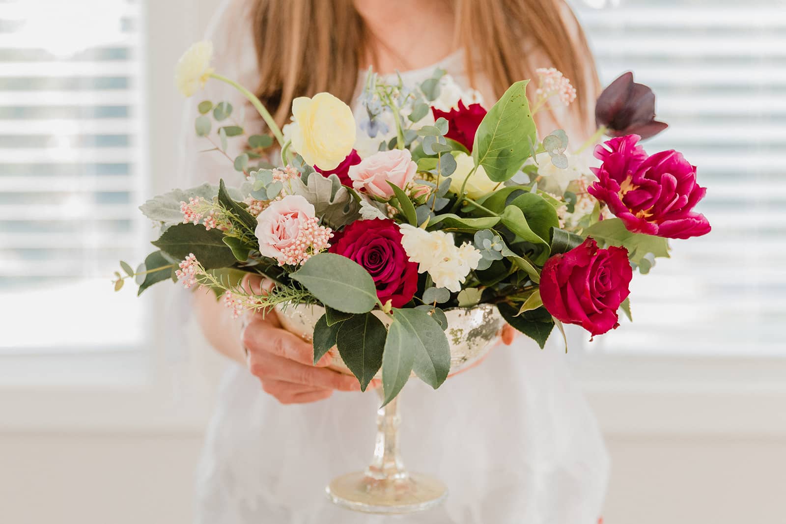
Holly Yee of Holly Yee Floral Architecture guests blogs today and shares her knowledge on floral design and colors.
As a wedding industry professional one of the very first questions I ask during my floral consultations is about color palette. Determining the floral color palette that will best compliment a couple’s overall wedding colors is crucial for creating an event with aesthetic balance, cohesion, and harmony.
Sometimes, however, couples do not have a defined wedding color palette or their wedding colors are a little bit broader. And that’s totally okay! Whether you are a Floral Designer, a Planner, or other type of wedding professional, there are specific components of a wedding that you can use to help guide your clients to identify the best colors for their weddings.
Basics of Color Theory
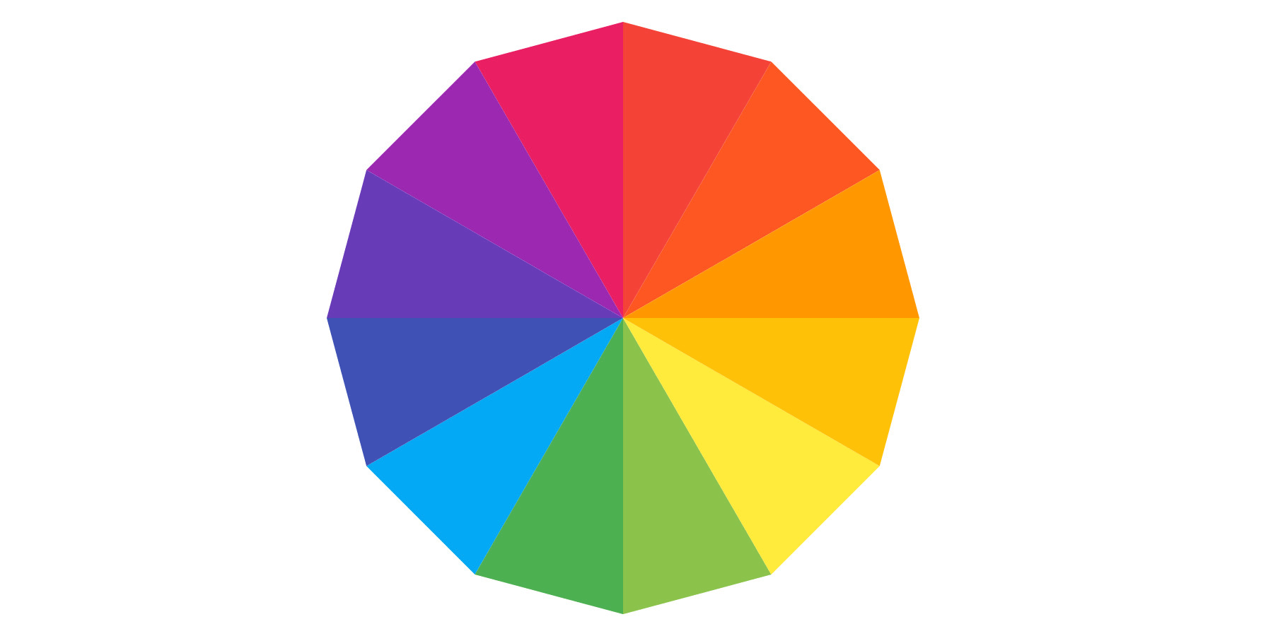
First, though, let’s take a look at the basic principles of color theory. These principles are the guidelines often applied when choosing color palettes that ultimately are balanced and appealing. Understanding color theory is crucial for great design. The color wheel, which was invented in 1706 by Sir Issac Newton, can be used as a compass for choosing colors that work well together.
Three of the most fundamental color combination categories are: monochromatic, analogous, and complimentary. Here is what they mean and why each category works well in design:
Monochromatic
Monochromatic colors are variations of one color (hue) with different tints, tones, and shades. A monochromatic color palette is simple, yet sophisticated. Monochrome creates harmony and is calming.

Analogous
Analogous colors live next to each other on the color wheel. Color combinations using hues with close proximity to one another on the color wheel can create a sophisticated and pleasing harmony. Analogous colors are guaranteed to work great together.

Complimentary
Complimentary colors are opposite from each other on the color wheel creating. They create strong contrast and play up each other’s intensity. Complimentary colors are often perceived as soothing as they stimulate different parts of the eye.

With this basic understanding of color theory, here are things to consider when helping your clients narrow in on their wedding colors.
Venue Colors & Aesthetic
It can be easy for couples to overlook their wedding venue when deciding on wedding colors. Wedding venues that are neutral in color are more adaptable to a variety of wedding colors.

Some wedding venues, especially hotel ballrooms, however, can have distinct color accents, either colors in the carpet or colors in the ceiling fixtures.
It’s really, really hard to not notice the blue and orange patterned carpet when you’re sitting down for dinner. And while your soft pink floral centerpieces may be quite lovely on the white linen tables, they will look out of place next to that carpet.
Most couples are probably not going to take this detail into consideration. There are so many other pieces to their wedding day puzzle they are trying to fit together that this is often overlooked. As a member of the wedding community, you can help guide you client’s by making suggestions, especially if you have done other events at that same venue and know the decor.
Season

Sometimes Mother Nature can be a guiding hand in choosing a great wedding color palette. If your clients are getting married in the fall, for example, it can be advantageous to use a fall color palette – reds, oranges, and yellows. The changing season can often lend itself to certain colors that become abundant in nature that time of year. Don’t be afraid to take advantage of an established harmonious color palette that just makes sense!
Did you know that every month at our meetings, we feature local vendors to help make our meetings come to life! If you would like to showcase your work at an upcoming meeting, please get in touch with us on our contact us page!
Themes

Some of my favorite weddings to be a part of are themed weddings. True themes go beyond the standard wedding style terms of chic, rustic, vintage, modern, boho, etc. Themes are overarching concepts that allow for aesthetic definition and structure.
Many of the annual Holidays can work well as a wedding theme. If your couple is getting married in December around the winter Holidays you might suggest a color palette of white, green, and red.
While true themes aren’t especially common for weddings, they are very popular for other events like corporate events, auctions, galas, award ceremonies and more.
Personal Color Preferences
Sometimes couples can define their wedding color palette by simply starting with their personal color preferences. If they have a favorite color or a particular hue they find themselves wearing a lot, that could be a good first step for thinking about the colors for their wedding.

Color that is placed intentionally in design is a way to engineer a desired experience. So, it’s no wonder that choosing a great wedding color palette is important and, rightfully so, commands a lot of consideration. An occasion that’s as special as a wedding should look and feel as significant as it is. Your clients will thank you for helping them define their wedding color palette to create a beautiful event that looks and feels spectacular.
Thank you for reading our blog! We have a large network of local wedding industry professional. We invite you to view our membership directory and reach out to potential vendors for collaborations.